Sunday, November 27, 2011

DIY christmas decoration

Ok…well it’s not quite December, so I’m breaking my own “don’t think about Christmas until December 1st” rule.

I tried an easy, low cost decoration idea yesterday. I saw it in the latest Style at Home magazine (www.styleathome.com) first. Then, I saw it again after that. Then, it seemed that everywhere I look, I see these adorable little trees everywhere!

Here’s the project description how to:

  • Gather a selection of patterned wallpapers in similar tones.
  • Draw a circle in pencil on the back of a piece of wallpaper (the size of the circle will determine how tall the cone will be) and cut it out using scissors.
  • Mark the mid-point and cut a seam to the mark.
  • Bring the two edges of the seam together and continue to roll the paper to create a cone shape.
  • Secure the outside edge to the cone with double-sided tape.
  • Repeat with remaining papers.
Tips:
  • I didn’t have wallpaper samples, so I picked up a few individual pieces of paper from the scrapbook section at Michaels (www.michaels.com). Be sure not to buy anything too thick, as it is difficult to roll without tearing.

  • I used different sized pot lids and bowls to trace the circles on the back of my papers.


  • I didn’t have any double-sided tape on hand…the glue stick works just fine!


The end result is a fun, low cost and easy DIY holiday decoration.

Cone-shaped trees of various heights can be highly impactful when displayed en masse. Imagine them as a centre peice for a table setting, placed on a shelf, or on a side table or coffee table. Anywhere that you have a bit of space to display them in bunches!


Here are just a few of the ones I didI choose some bright colors that fit with my decor, and some in the more traditional red and green but with patterns, textures and sparkles (of course!).


I rolled some of them the opposite way and you can see the layers, but I liked the effect, so I left some that way.

Can’t wait to put them out with my other decorations (but I will because after all, it’s NOT Christmas yet!!).

Enjoy!


For more about rouge, visit www.littlered.ca or check out past blogs at www.justalittlerouge/blogspot.com


Sunday, November 20, 2011

bedroom makeover...the reveal

As per last week’s blog…this week’s project was to make over a bedroom…mine!

My goal was to give the room a significant makeover in terms of the look & feel, while using all the same accessories, sticking to a tight budget.


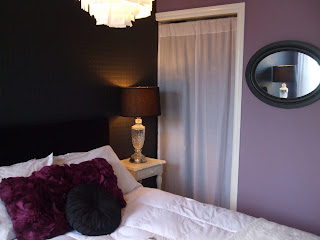
The new color scheme is a grey-ish lavender-ish (amorous AF-600, Benjamin Moore) and a beautiful grey-ish black (wrought iron 2124-10, Benjamin Moore). The wrought iron was painted over the existing paintable wallpaper and has become more of a feature wall than it was before, because it’s a different color than the rest of the room.


I am always amazed what a can of paint can do!

Next, I took another look at the other accessories in the room and culled through them. A chair (that only served as a place to throw clothes), and giant green palm leaves were taken out of the room.

To make my existing accessories work, I also did a few simple DIY projects to pull the look together.


Headboard – I already had two black velvet curtains in the house that I don’t use anymore, so I used one to do a quick and simple reupholster of the headboard. Layout the fabric right over the existing fabric, use staple gun to secure the fabric to the back of the headboard, pulling it nice and tight all the way around so there are no wrinkles, and you are done! A whole new look – plush, chic, and highlights the feature wall behind the bed. At the same time, it’s a nice backdrop to the all white bedding.


Nightstand – one of my existing nightstands was light blue…a perfect match to the old wall color. A couple of quick coats of white paint, and now it fits the new color scheme. And it matches the nightstand on the other side of the bed, too. I love the black and white look of the nightstands and the bedding against the black wall, headboard and lampshades.


Artwork – my existing artwork no longer looked right in the room on the freshly painted wall. So, I took and old canvas and covered it in wrapping paper that I found in a really cool pattern and color. Popped it back into the frame, and it looks like vintage wallpaper! This serves as a big hit of color to the room…and is perfect, because when I get tired of it or feel like updating it to a different color, it will be a cinch to do!

Closet door/ curtain – the grey damask curtain with grommets covering the closet no longer looked right in the new color scheme. I had a set of sheer white tabbed curtains that I wasn’t using any longer (see…ALWAYS hang on to that stuff…you will find interesting uses for them at some point!). When hung by the tabs, you could still see into the top of the closet (ugh) and that looked messy. So, I flipped the curtain upside down, put the rod through the bottom hem and hung them like that. Because the length was perfect, I just carefully snipped off the tabs, and now the look is clean and crisp. Just like that material was made to cover the doorway perfectly.


Budget breakdown was:


• Paint and supplies -- $101 (Benjamin Moore’s Aura paints)
• Wall art (wrapping paper) -- $3.99 (I have tons left over to wrap presents!)
• Splurge (round, gathered black silk pillow) -- $12.99

Grand total was $117.98. Just under $120 bucks…how can you beat that!?!

I was going for chic, mixed with a bit of personality, and maybe even a little sexy thrown in and I think I achieved that goal.

I’m very happy with my refreshed room….hmmm…maybe I should just have a small nap now…


For more about rouge, visit www.littlered.ca or check out past blogs at www.justalittlerouge/blogspot.com

Monday, November 14, 2011

bedroom makeover

Well…I’m feeling quite uninspired this week, I’m afraid. I even cruised around Home Sense yesterday, and still, nothing. (Now that’s hard to do!)

Since I refuse to talk about all the wonderful holiday décor ideas until closer to Christmas, I’m keeping those ideas at bay for now. But I promise to start sharing them soon...
So, this week’s project will be a bedroom makeover – mine!

I’ve enjoyed the blue color scheme I used to decorate it when I first bought the house. It's crisp, fresh and fun. It's evolved some over  the last 4 years -- adding some greys, a dash of purple and some black -- as I think all good design should,  but I've decided that it’s time for a bigger change.


I’m on a tight budget, so I thought it would be a good one to blog about. My goal is to give the room a significant makeover in terms of the look & feel, while using all the same accessories.

That's a good challenge, but not an impossible one.

Playing with paint will be the answer. New color scheme is a grey-ish lavender-ish (amorous AF-600, Benjamin Moore) and a beautiful grey-ish black (wrought iron 2124-10, Benjamin Moore).


Amorous is described as "Intense without being overpowering, this soft shade of purple with red undertones imparts a sense of grandeur and opulence to any room".
I’m going for something more chic, mixed with a bit of personality and maybe even a little sexy thrown in.


This is a virtual bedroom from the Benjamin Moore website (http://www.benjaminmoore.com/) that allows you to virtually paint a room. Very helpful in getting a good idea of how the colors will come together.

You’ll be amazed what a couple cans of paint can do….check back next week to see the end result!


For more about rouge, visit www.littlered.ca or check out past blogs at www.justalittlerouge/blogspot.com

Sunday, November 6, 2011

upcycled mirror

I found this wonderfully large mirror about two years ago…and it’s been on the “project list” in the basement ever since. When I say found, I really mean that I saw it on the sidewalk one day, out with someone’s trash. I know, I know…it’s not the first time this has happened.

And really, it doesn’t happen that often.


Anyway, I could see the potential. The frame was in great shape, albeit it has seen better days, but still solid wood with a simple style. The mirror was even in tact! The only piece a bit worse for was that the pressboard backing was a bit warped.


In the spirit of upcycling, I took it home. Finally, I found a use for it...the perfect fit for a friend’s cottage. So, the last time I visited the cottage, I packed up my stuff for the visit, and jammed in all the things I would need to do this project at the cottage in the car…

Here are the steps to this makeover project:

1. thorough clean with a damp cloth, wipe dry

2. place on a large drop cloth, in a well ventilated area (outside is best)


3. paint with awesome blue paint left over from another project. (Note: normally, I would recommend priming it first, then painting, but I forgot the can of primer and was too lazy to drive to the nearest town to buy some.)

4. Let dry. Paint second coat of blue paint and let dry.

5. Paint third coat of paint (argh. That’s what happens when you don’t use primer!) and let dry.

6. Flip over frame, place clean mirror into the frame.


7. Add the newly flattened backing into the frame. (I just put this under some heavy stuff for about a week or so to help straighten it out again. It wasn’t perfect, but when it was secured to the frame, you’d never know it.)

8. Secure the backing into the frame with small finishing nails around the entire outside edge.

9. Volia – you are done!

In the spirit of upcycling, I gave this old mirror a new life. I left it for the new owners to hang it on the wall...in case they decided to put it somewhere else.

I like it here because it reflects the light into a dark-ish area of the cottage (and is perfect if you really want to check out your cottage hair!) I think it fits perfectly in the cottage eclectic décor.


This 2 day project was done on a budget that breaks out like this:

 “vintage” mirror (random sidewalk) – $0

 paint – left over from past painting projects - $0

 finishing nails (Home Hardware) - $0.09


Now, that’s hard to beat!


For more about rouge, visit www.littlered.ca or check out past blogs at www.justalittlerouge/blogspot.com