Showing posts with label Benjamin Moore. Show all posts

Sunday, November 20, 2011

bedroom makeover...the reveal

As per last week’s blog…this week’s project was to make over a bedroom…mine!

My goal was to give the room a significant makeover in terms of the look & feel, while using all the same accessories, sticking to a tight budget.


The new color scheme is a grey-ish lavender-ish (amorous AF-600, Benjamin Moore) and a beautiful grey-ish black (wrought iron 2124-10, Benjamin Moore). The wrought iron was painted over the existing paintable wallpaper and has become more of a feature wall than it was before, because it’s a different color than the rest of the room.


I am always amazed what a can of paint can do!

Next, I took another look at the other accessories in the room and culled through them. A chair (that only served as a place to throw clothes), and giant green palm leaves were taken out of the room.

To make my existing accessories work, I also did a few simple DIY projects to pull the look together.


Headboard – I already had two black velvet curtains in the house that I don’t use anymore, so I used one to do a quick and simple reupholster of the headboard. Layout the fabric right over the existing fabric, use staple gun to secure the fabric to the back of the headboard, pulling it nice and tight all the way around so there are no wrinkles, and you are done! A whole new look – plush, chic, and highlights the feature wall behind the bed. At the same time, it’s a nice backdrop to the all white bedding.


Nightstand – one of my existing nightstands was light blue…a perfect match to the old wall color. A couple of quick coats of white paint, and now it fits the new color scheme. And it matches the nightstand on the other side of the bed, too. I love the black and white look of the nightstands and the bedding against the black wall, headboard and lampshades.


Artwork – my existing artwork no longer looked right in the room on the freshly painted wall. So, I took and old canvas and covered it in wrapping paper that I found in a really cool pattern and color. Popped it back into the frame, and it looks like vintage wallpaper! This serves as a big hit of color to the room…and is perfect, because when I get tired of it or feel like updating it to a different color, it will be a cinch to do!

Closet door/ curtain – the grey damask curtain with grommets covering the closet no longer looked right in the new color scheme. I had a set of sheer white tabbed curtains that I wasn’t using any longer (see…ALWAYS hang on to that stuff…you will find interesting uses for them at some point!). When hung by the tabs, you could still see into the top of the closet (ugh) and that looked messy. So, I flipped the curtain upside down, put the rod through the bottom hem and hung them like that. Because the length was perfect, I just carefully snipped off the tabs, and now the look is clean and crisp. Just like that material was made to cover the doorway perfectly.


Budget breakdown was:


• Paint and supplies -- $101 (Benjamin Moore’s Aura paints)
• Wall art (wrapping paper) -- $3.99 (I have tons left over to wrap presents!)
• Splurge (round, gathered black silk pillow) -- $12.99

Grand total was $117.98. Just under $120 bucks…how can you beat that!?!

I was going for chic, mixed with a bit of personality, and maybe even a little sexy thrown in and I think I achieved that goal.

I’m very happy with my refreshed room….hmmm…maybe I should just have a small nap now…


For more about rouge, visit www.littlered.ca or check out past blogs at www.justalittlerouge/blogspot.com

Monday, November 14, 2011

bedroom makeover

Well…I’m feeling quite uninspired this week, I’m afraid. I even cruised around Home Sense yesterday, and still, nothing. (Now that’s hard to do!)

Since I refuse to talk about all the wonderful holiday décor ideas until closer to Christmas, I’m keeping those ideas at bay for now. But I promise to start sharing them soon...
So, this week’s project will be a bedroom makeover – mine!

I’ve enjoyed the blue color scheme I used to decorate it when I first bought the house. It's crisp, fresh and fun. It's evolved some over  the last 4 years -- adding some greys, a dash of purple and some black -- as I think all good design should,  but I've decided that it’s time for a bigger change.


I’m on a tight budget, so I thought it would be a good one to blog about. My goal is to give the room a significant makeover in terms of the look & feel, while using all the same accessories.

That's a good challenge, but not an impossible one.

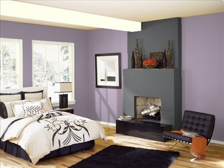
Playing with paint will be the answer. New color scheme is a grey-ish lavender-ish (amorous AF-600, Benjamin Moore) and a beautiful grey-ish black (wrought iron 2124-10, Benjamin Moore).


Amorous is described as "Intense without being overpowering, this soft shade of purple with red undertones imparts a sense of grandeur and opulence to any room".
I’m going for something more chic, mixed with a bit of personality and maybe even a little sexy thrown in.


This is a virtual bedroom from the Benjamin Moore website (http://www.benjaminmoore.com/) that allows you to virtually paint a room. Very helpful in getting a good idea of how the colors will come together.

You’ll be amazed what a couple cans of paint can do….check back next week to see the end result!


For more about rouge, visit www.littlered.ca or check out past blogs at www.justalittlerouge/blogspot.com

Sunday, January 9, 2011

Color of the Year - Vintage Wine

Benjamin Moore's color designers are forecasting "vintage wine"(2116-20) as Envision Color 2011's Color of the Year.

"First seen on the fashion runways of New York, Paris, and Milan, this rich hue with a deep brown base and a hint of smoky violet is just as magnificent in the home.

Vintage wine is an anchoring, rich hue that combines the comfort of a brown with the luxury of a smoky violet.

As an undertone in many of the latest wood finishes, leathers, and other textiles, vintage wine, and its lighter variations, will make a great paint color pick for many applications over the coming years."

rouge note: while I’m not crazy about the other color it’s mixed with here, I can see this beautiful color with smoky greys and furniture and accessories that have a touch of vintage to them. Warm, inviting, and luxurious!

For more info about benjamin moore color trends, check out: www.benjaminmoore.com

What do you think??


For more about rouge, visit www.littlered.ca or check out past blogs at www.justalittlerouge/blogspot.com

Friday, April 3, 2009

color trends for 2010

Last week, I went to the Benjamin Moore Color Trends Forecast for 2010. Designed for “Color Professionals & Architects”, it was presented by their Color & Design Manager and detailed their projections in terms of color, design and trends for 2010.

Hard to say what I liked best.

There was a bit of talk about how the entire industry is changing so that it’s much more green. A combination of things like new technologies and VOC regulations are driving this. That’s not a bad thing in my books.

There was also some interesting information on two of Benjamin Moore’s new products including “Aura”, which you’ve probably already seen commercials for. It’s a new 100% acrylic resin paint that promises some great features: dries in 1 hour, 2 coat maximum, contains self-primer and self sealer (read: you don’t have to use primer and it still promises that you’ll never need any more than 2 coats!), is durable & washable, and has exceptional hiding power.

The second product is called “Natura” and is their greenest product. Actually, it’s the first of its kind in the industry. It promises to be odor-free, fast drying (also 1 hour), and VOC free. This one does recommend the use of a primer (they also make a “Natura” primer) and colors will be available in flat, eggshell and semi gloss. This product will be in stores in May. Sounds good to me…I hate the smell of paint and really try hard not to think about what I’ve been breathing in.

Now to the sexy stuff. This part of the presentation was a combination of music and tons of photos from around the world that included the very latest in fashion trends, new design influences and, of course, colors.

It was such a visual feast, my brain was buzzing for the rest of the afternoon. I’d show you pictures, but the color chips aren’t available just yet…

Here are the three color themes that Benjamin Moore is predicting for 2010:

One – “genesis” which is all about real colors found in the natural world. From green to yellow, the greyscale continues. Carbon color footprints. New beige and white. Monochromes in colored and earthen neutrals. Beautiful hues of browns, creams, greens, reds…think sand, flowers, grasses, root vegetables. Colors include: wild mushroom, forest moss, yellow finch, frostline, granite.

Two – “the new luxury” which is more about values and less about wealth. Sophisticated deep and rich tones. Bold translucency and art-inspired brights contrast against beige grounds. Gold, bronze, copper. Sustainable color choices accented with luxurious chromas of organic brights….think eco-chic. Colors include: sandlot gray, granite, wild orchid, caponata, summer plum, gold.

Three – “ingenuity” which is considered more out of the box and fun. Unexpected and free. Sporty hues and glimmers of metallics. Playful color tones. Prismatic color, ombre effects. Bold and vibrant yellows, blues, oranges…think freedom of expression and right-brain thinking. Colors include: seaweed, midnight navy, salsa, fairview taupe, bronze.

I'm excited and have lots to think about in terms of new color combinations. But the two biggest burning questions for me are:

Who’s job is it to aptly name each and every one of the new colors & write the prose that describes these color trends?

…and…

How do I become part of the “North American Creative Forecasting Team” that travels the globe to identify color, design influences and themes of new fashion trends?

Give me a call, Benjamin Moore. I’m available.