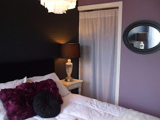
My goal was to give the room a significant makeover in terms of the look & feel, while using all the same accessories, sticking to a tight budget.
The new color scheme is a grey-ish lavender-ish (amorous AF-600, Benjamin Moore) and a beautiful grey-ish black (wrought iron 2124-10, Benjamin Moore). The wrought iron was painted over the existing paintable wallpaper and has become more of a feature wall than it was before, because it’s a different color than the rest of the room.
I am always amazed what a can of paint can do!
Next, I took another look at the other accessories in the room and culled through them. A chair (that only served as a place to throw clothes), and giant green palm leaves were taken out of the room.
To make my existing accessories work, I also did a few simple DIY projects to pull the look together.
Headboard – I already had two black velvet curtains in the house that I don’t use anymore, so I used one to do a quick and simple reupholster of the headboard. Layout the fabric right over the existing fabric, use staple gun to secure the fabric to the back of the headboard, pulling it nice and tight all the way around so there are no wrinkles, and you are done! A whole new look – plush, chic, and highlights the feature wall behind the bed. At the same time, it’s a nice backdrop to the all white bedding.
Nightstand – one of my existing nightstands was light blue…a perfect match to the old wall color. A couple of quick coats of white paint, and now it fits the new color scheme. And it matches the nightstand on the other side of the bed, too. I love the black and white look of the nightstands and the bedding against the black wall, headboard and lampshades.
Artwork – my existing artwork no longer looked right in the room on the freshly painted wall. So, I took and old canvas and covered it in wrapping paper that I found in a really cool pattern and color. Popped it back into the frame, and it looks like vintage wallpaper! This serves as a big hit of color to the room…and is perfect, because when I get tired of it or feel like updating it to a different color, it will be a cinch to do!
Closet door/ curtain – the grey damask curtain with grommets covering the closet no longer looked right in the new color scheme. I had a set of sheer white tabbed curtains that I wasn’t using any longer (see…ALWAYS hang on to that stuff…you will find interesting uses for them at some point!). When hung by the tabs, you could still see into the top of the closet (ugh) and that looked messy. So, I flipped the curtain upside down, put the rod through the bottom hem and hung them like that. Because the length was perfect, I just carefully snipped off the tabs, and now the look is clean and crisp. Just like that material was made to cover the doorway perfectly.
Budget breakdown was:
• Paint and supplies -- $101 (Benjamin Moore’s Aura paints)
• Wall art (wrapping paper) -- $3.99 (I have tons left over to wrap presents!)• Splurge (round, gathered black silk pillow) -- $12.99
Grand total was $117.98. Just under $120 bucks…how can you beat that!?!
I was going for chic, mixed with a bit of personality, and maybe even a little sexy thrown in and I think I achieved that goal.
I’m very happy with my refreshed room….hmmm…maybe I should just have a small nap now…
For more about rouge, visit www.littlered.ca or check out past blogs at www.justalittlerouge/blogspot.com


No comments:
Post a Comment